
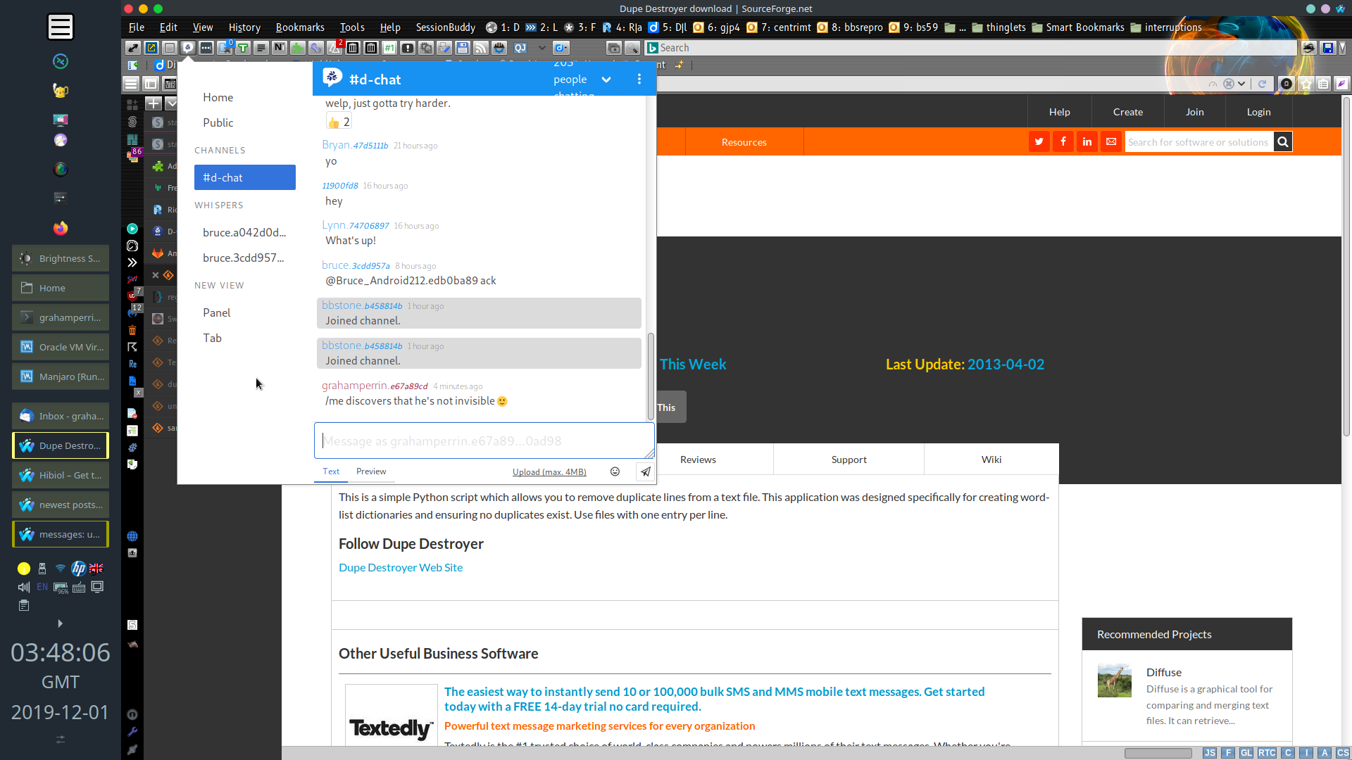
Contrast could be better, IMHO.
Where grey is used for text, it’s not dark enough for me.
Pale blue text on a grey background is not great.
Normally I’d use Blacken but the modern version of the extension is not effective in this context (constraints of WebExtensions APIs, I assume):
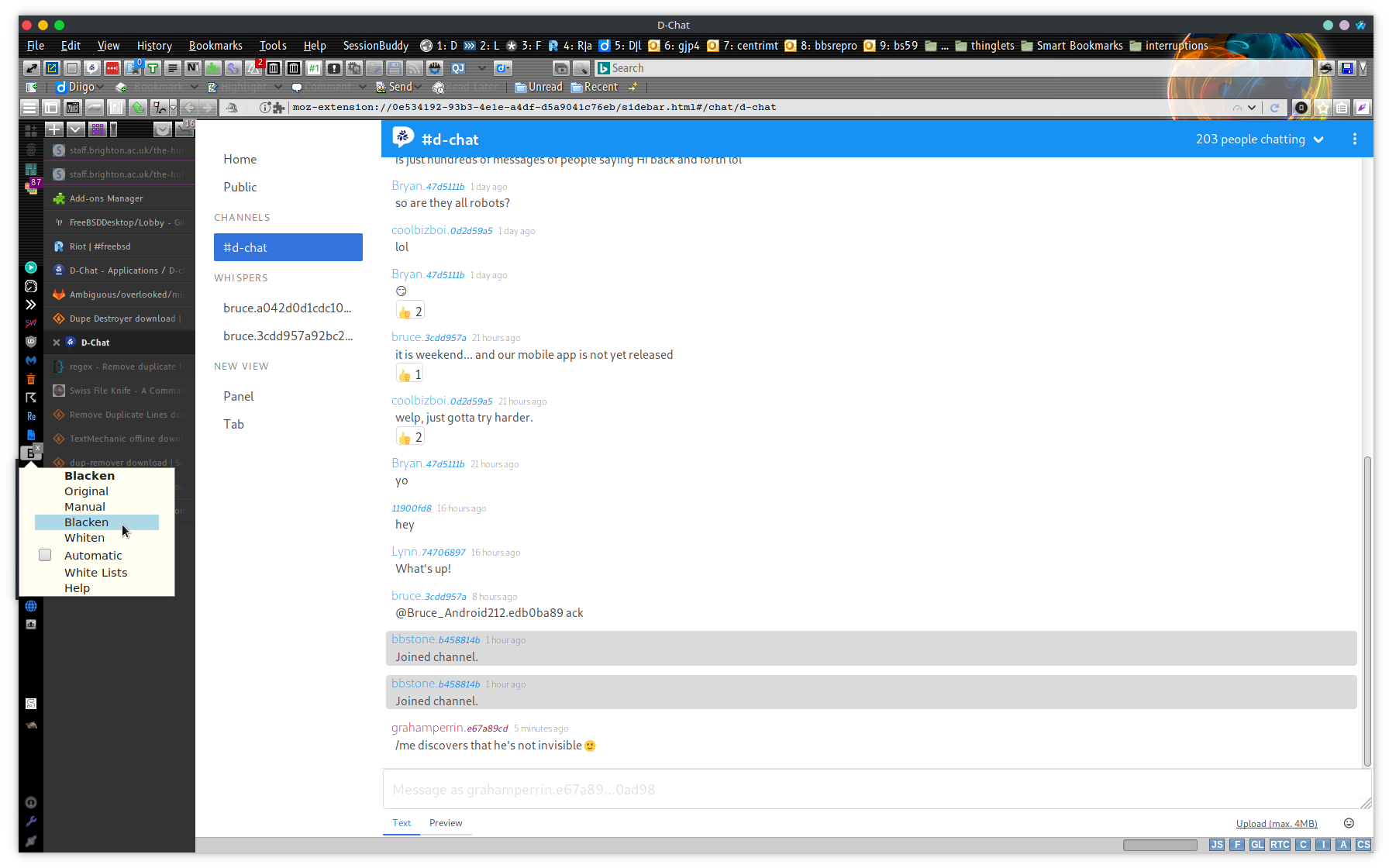
I tried the last legacy version (2.2.33) https://web.archive.org/web/20171109170601/https://addons.mozilla.org/en-US/firefox/addon/blacken/, this didn’t work, either.
I could try earlier legacy versions – caa:addon/blacken/versions in the Classic Add-ons Archive – and probably find one that’s capable of blackening extension pages but all things considered, I prefer to keep the latest version (for Firefox Quantum) …